
AI Employee Training Platform
ROLE:
Product designer
DURATION:
Ongoing
Product Showcase


Introduction
Project overview
KTP is an AI-powered training platform that simulates real workplace conversations—helping employees build emotional regulation and communication skills through interactive, scenario-based learning. Instead of relying on passive lectures, users engage in conversations via text, video, and feedback tools that mirror real work situations like deadline conflicts, performance reviews, or tense 1:1s.
The goal: make training feel less like training and more like practice.
My role
I led the product design from end to end: translating instructional design flows into scalable UX architecture, defining interaction and visual patterns, and crafting the core experience across chat, mentor guidance, onboarding, and analytics.
Context
This was a B2C MVP targeting enterprise employees. The experience includes both web and mobile platforms, but this case study focuses on the web version shipped between Jan and Apr 2025.

Problem
What wasn't working
Traditional corporate training tends to be passive, predictable, and emotionally flat. Employees are asked to navigate real-world tension—giving feedback, setting boundaries, handling conflict—but the tools they’re given rarely reflect that complexity.
In early user interviews, employees described training as “out of touch” or “one-size-fits-all.” They didn’t feel prepared for situations that involved emotion, ambiguity, or pressure.
Our challenge was to reimagine training as an immersive, emotionally intelligent experience—one that mirrors the messiness of real conversations while staying structured enough to drive learning.

Research & Insights
We began by aligning user and business needs. The goal was clear: create a tool that doesn’t just teach theory, but builds real-world emotional resilience through practice.
Two primary user needs guided the experience:
-
Final Users (Employees): A tool to practice difficult conversations with emotionally realistic AI, improving decision-making and conflict resolution over time.
-
Academic/Reviewer Profiles: A platform where user growth could be measured, tracked, and evaluated across communication skills.
At the same time, we gathered secondhand research on onboarding fatigue, emotional learning, and engagement patterns from platforms like Duolingo, Medium, and Replika to inform design decisions.
Competitive and Comparative Analysis
We benchmarked KTP against leaders in simulation-based learning, including Skillgym, VirtualSpeech, Talespin, and Bodyswaps.

Structuring the Experience
Where I wanted to take it
The instructional design team provided a five-stage learning model: Introduction, Observation, Cognitive Process, Practice, and Feedback. Each phase focused on building emotional awareness and decision-making skills progressively.
Our challenge was to translate this educational structure into a seamless digital experience—keeping it engaging, intuitive, and emotionally resonant from the first interaction.

The Wireframes
Translating pedagogy into UX structure
We began wireframing with a mobile-first mindset, mapping each stage of the instructional model into distinct, scannable layouts. From onboarding to feedback, every screen was designed to keep users engaged through clarity and rhythm.
Midway through, shifting priorities pushed us to adapt quickly to desktop—prompting a reorganization of layout and navigation while preserving the integrity of the flow.
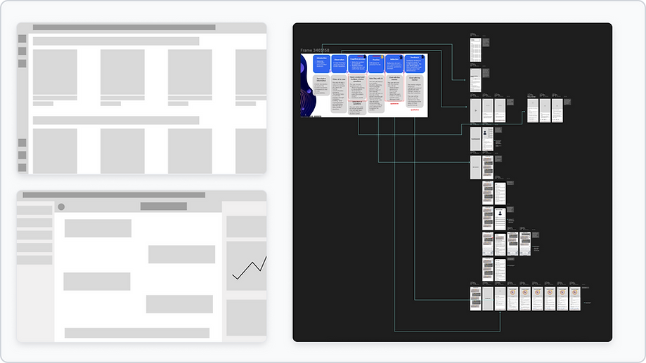
First Round of Mockups
The initial mockups leaned heavily on a full-screen layout, which unintentionally broke the illusion of a real conversation. The chat felt stiff, overly structured, and lacked spatial rhythm. Users noted the awkward spacing, disjointed flow, and a layout that resembled a web form more than a messaging tool.
Across other screens, such as onboarding and scenario details, content blocks were either too dense or didn’t feel purposeful—impacting readability and emotional tone.


Final Design
Chat Experience
We abandoned the step-based sidebar to prioritize realism and focus. The new layout mimics a desktop environment with floating chat and mentor widgets, creating an immersive, distraction-free space that feels familiar and emotionally resonant—like Slack meets FaceTime. The chat now adapts dynamically to user decisions, with the mentor offering contextual breakdowns instead of static tips.

AI Mentor Panel
Originally designed as a passive tooltip, the AI mentor evolved into an active guide. Users can click in at any point to break down reactions, tone, and intent. This change came from user observation showing hesitation and uncertainty after difficult replies—the mentor now reduces that friction without feeling hand-holdy.

Scenario Context - Now Editorial
We redesigned the intro screens into an editorial flow after users skipped the linear onboarding. The new approach adds rhythm with bold headers, illustrations, and concise sections, making the educational structure feel more like a narrative and less like homework. This layout increased user retention across simulations.

Performance Dashboard
Instead of showing a single score, we introduced an identity-based insight system (“You are The Strategist”) to tie reflection to behavior. This helped users not just understand what they did, but who they were becoming—an idea inspired by strengths-based coaching. Visualizations were restructured to highlight progress and reaction patterns over time.

Scenario Selection Modal
Originally a full details page, we simplified this into a modal after reducing content per scenario. The decision prioritized flow over information: we wanted users to browse and act quickly instead of getting stuck reading. This new lightweight pattern helped streamline scenario launching by 40%.

Settings Page
To support accessibility and personalization, we added language toggles, dark/light mode, and notification settings into one simplified view. We intentionally avoided over-compartmentalization, instead opting for grouped categories with inline actions to reduce click depth and improve control discovery.

Results
The redesign wasn’t just cosmetic — it resolved real friction points across the user journey. From increasing emotional engagement in simulations to streamlining the way users onboard and reflect, we translated research into measurable outcomes that validated our UX decisions.

Mobile Version
The mobile experience was redesigned from the ground up to ensure full parity with desktop, without compromising usability or clarity. We streamlined navigation, adapted layouts for smaller screens, and optimized interaction patterns to maintain immersion—even in high-stakes scenarios. This allowed users to complete entire simulations on the go, making practice more accessible and consistent.